Featured

My film archive digitally remastered for stock.

“A work in progress”… subscribe to see frequent updates

Mainly images shot with my Linhof Technorama, 6 x 17 cms transparencies. Digitally remastered for enhanced viewing.

An illustration for transport on the Dutch waterways, the car, bike and boat are on the boat plus freight.

A rather interesting set up showing landscape and transport in an area where the boats are locked in and lowered or raised to different water levels…

This image below is a remastered digital image. In Luminar I tweaked the contrast and structure and in D x O Nik Collection no 4 adjusted the intensities and colours, plus sharpness to my liking.

Benmorven Woolshed, historic farm building.

The landscape format is ideal almost 1:3, making visuals just wide enough to resemble our human “wide angle ” vision including the peripheral.
The landscape below was spectacular in life size, however compressed to a monitor 2028 pixels wide it lost a lot of impact, therefore a bit of retouching had to be done to make it more “visual”.

Tosca – Italy

A different image – thanks Adobe CC. Handcoloured? No. AI coloured…
Amazing.

Oops, a happy unforeseen coincidence on the bottom left. Was so busy framing the tower between the leaves of the tree that I did not notice this curious look. My black and white negative was taken years ago (see cars!) and scanned.
Adobe has this new neural filter which colorizes a b/w image, I am amazed at the quality… It makes a very good rendition and I am pleased. It creates that perfect nostalgic feel…

Stunning dunes surrounding a cluster of cabbage trees on a black vulcanic sandy beach at Manukau Heads, Auckland – New Zealand. Shot on Linhof Technorama 6×17, b/w Kodak 6415 film, developed in Pyro. Digitally remastered and digital coloured. It is so rewarding making images for the second time. Is this still photography? Shot about 25 years ago, re birthed today the 3rd of July 2021…

Sabattier and friends revisited

Recently I was given a lot of old photos my deceased mother had collected over her long years. Some of my old photos were in that collection too.
Scanning them was the first step and since they were all old photos made on film and paper they displayed the old analogue darkroom effects, like overexposed, not properly fixed – that shiney blue black effect etc. Decided to look into some old developing techniques and did find the old darkroom had lots of “special effects” through developing and exposing.
Always liked to experiment, so most of the techniques in the darkroom I tried out and I was quite familiar with them. Nowadays, with digital development we have new fashion looks like HDR etc. So why not try to give the old scanned photos some old fashioned darkroom treatments?
The Sabattier effect was one of my old favourites.   Thankfully   – photoshop has no such filter. It has a solarisation filter but that is totally different. I set out to create such an old film developing process to replicate in digital format.
The photograph I had scanned was in colour, I converted it into black-and-white, and then what? Myself I had no clue. I looked up on the Internet how other people created Sabbattier effects. Some of them were totally wrong, but I found some that were quite close to the original black-and-white effects that I could remember from my old darkroom days. I adapted some of their techniques or work methods and after a little bit of “playtime” it was very easy to replicate the effect.
Let me tell you how it works in reality, in the old darkroom. Once you had exposed your film, with the correct exposure to make a good black-and-white photograph you re-exposed your film to another light source during development. Timing of the “second exposure” was critical, you had to wait a little bit I would say about two thirds of your total film developing time, then expose it to another light source. The intensity of the other light source was also critical. Too bright and it would blacken the whole film. Too little and not much would happen. I would say that a 25 W light bulb a couple of metres away for a few seconds was sufficient.
Let me deviate, if you are developing a 35mm black-and-white film it has been wound on a spiral of plastic. So the outer edge, the first six exposures are on the outer side of the film reel. They get the brunt of the second exposure. The layers behind that closer to the centre receive very little light. A 120 film is shorter and therefore easier to give a second exposure because there are only a few layers on the spiral. If for any reason anything went wrong you would have lost either a whole 36 exposure 35mm film, or 10 shots on a 120 film.
Therefore, I only used 10 x 12 cm sheet film. You could take that out of the tank, expose it to a second light source and the whole sheet would receive that exposure. If it went wrong, you only lost one shot. Way to go!
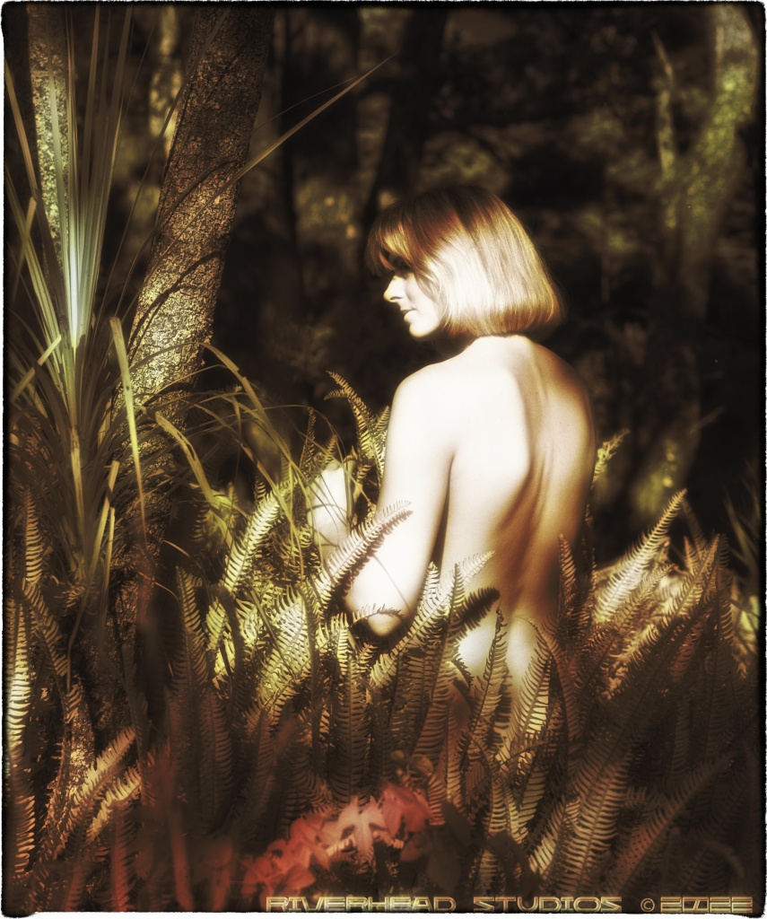
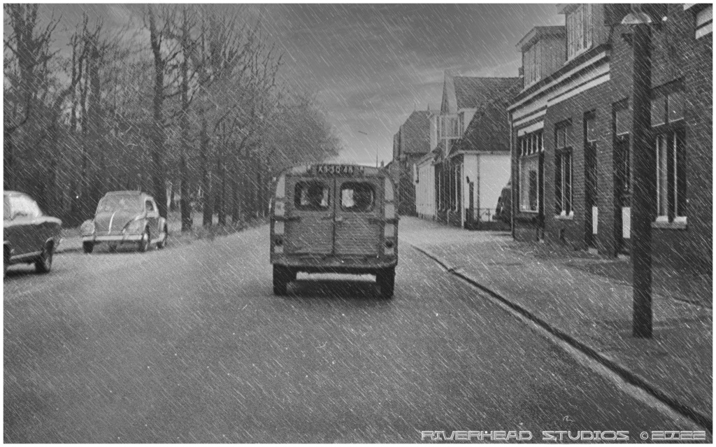
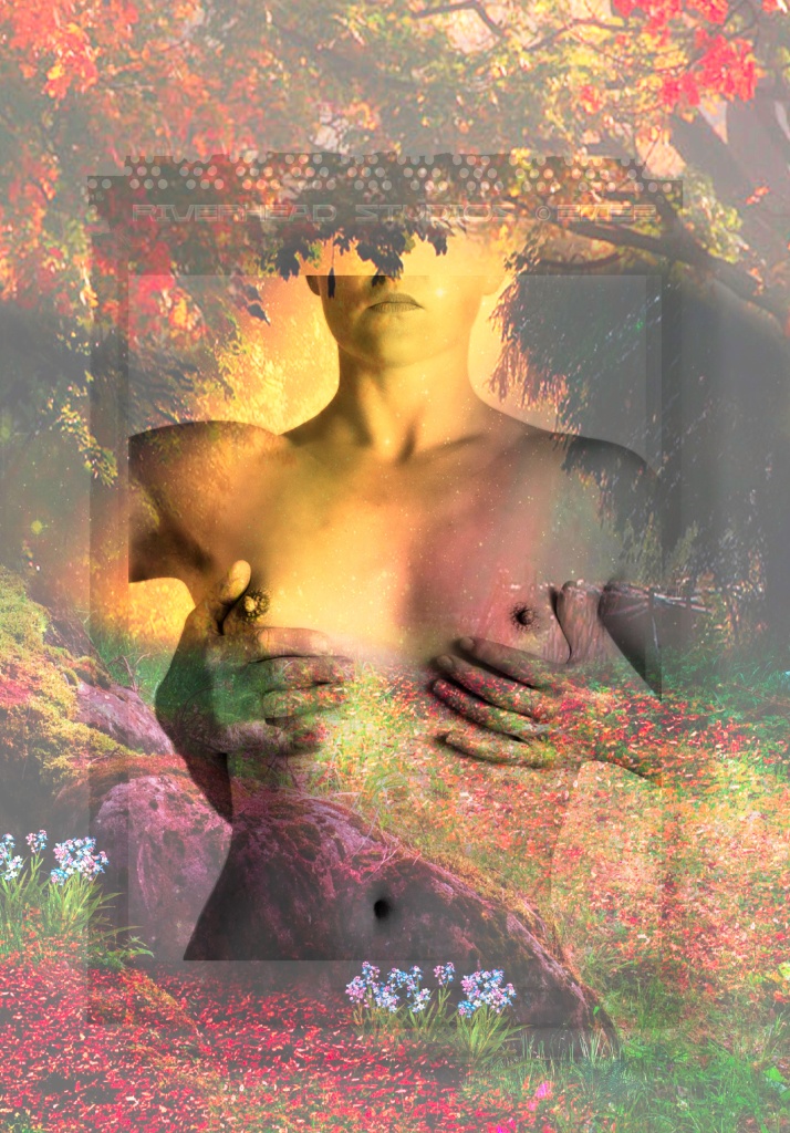
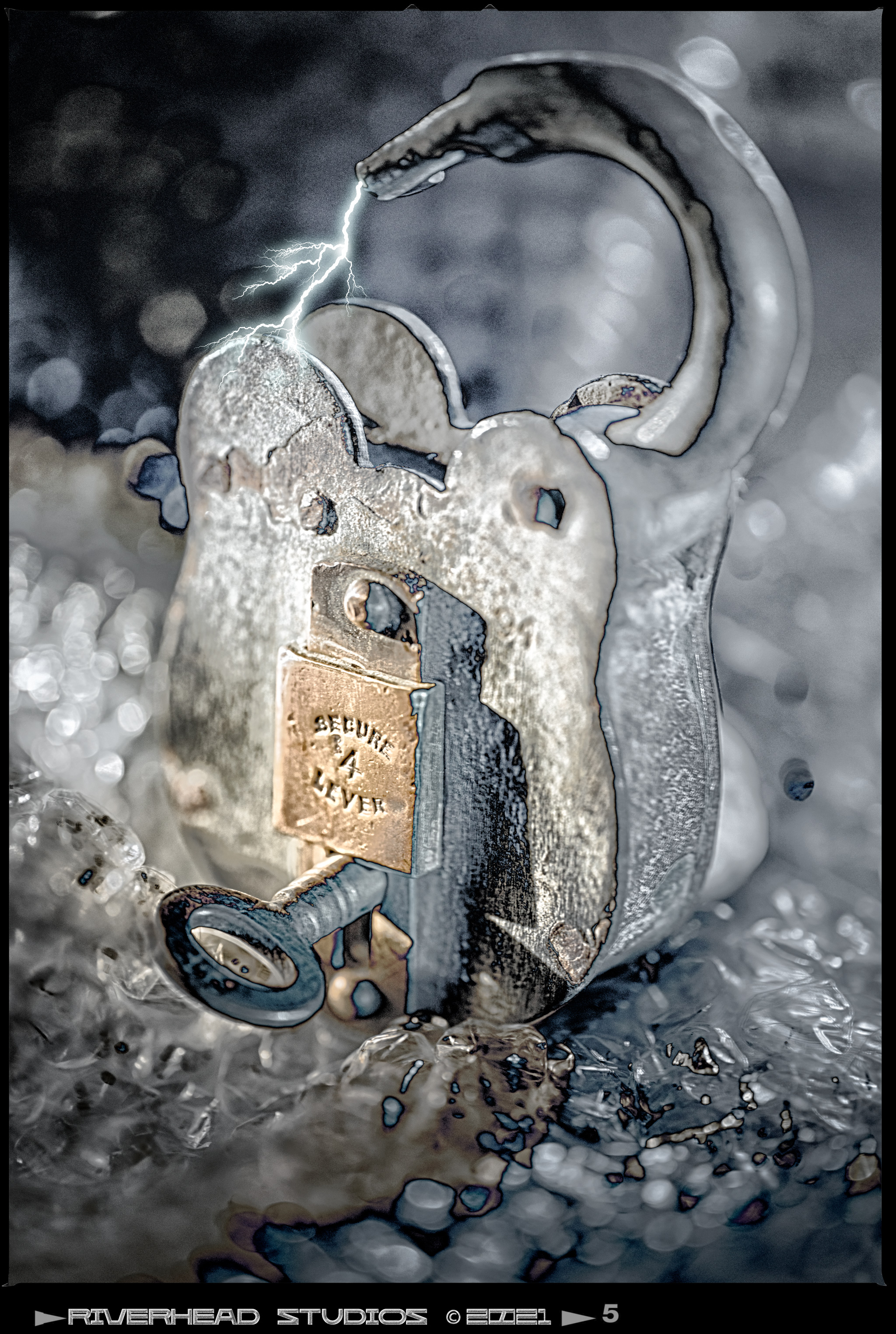
The result of this second exposure was to partially reverse the tonal values on your negative. Certain areas would reverse, others would stay the same, and some tonal values would slightly change. See my photographs.
There was another problem if you continued your development after that second light exposure, you would normally agitate the film to create an even development.
And here is the trick, after the second exposure carefully slide the partially developed sheet film back into the film developing tray. You were not going to agitate the film or the developer at all, you just gave it the remaining time of the total development time.

The developing of the silver halides was now taking place again. But since there was no movement of the developer we got that interesting Mackie line effect. This is a black line that occurs where there are two areas of contrast- light and dark- meeting during development.
If you’ve never been in a dark room, you possibly have no idea what I am talking about. I’m not a chemist so I can’t tell you exactly why that happens. If you gave it the normal developing time with agitation after the second exposure you would possibly over develop the film.
After the developing time was over, you fixed the film, and since you were dying to see how it looked like – after all you spent about 25 minutes in the dark room fiddling around with that film, you switched the white light on and started to look at your film sheet see the effects of your “Sabatier” effect.
I used exclusively film for this process, it is possible to repeat this scenario for photographic paper that is in the developing tray. Unfortunately the contrast and crispness somehow lacks on photographic paper. After all there is quite a difference between a 20 x 25 cm photograph and a 10 x 12 negative. You can enlarge the negative and when printing the negative you can control the contrast on photographic paper.
This is in short, a summary of how I used to make these photographs, but there are many little problems I have not covered like what kind of developer do you use, what film did you use -they all influence the end result.
I started to look through my old negative albums and found some more of my old experiments. I have solarised negatives and some old Agfa contour film. I will show you more later on.
I did find this an interesting process to replicate on existing material I have so I have now another project in mind to recreate some new photographs with the Sabatier effect.

There are many ways to produce similar effects in image editing programs by altering the curves settings on a separate layer. I intend to reactivate my blog since I have sold my studio and now practice photography in my lightroom with camera “au naturel” so to speak.

This  offers more opportunities then before, a new lifestyle, check it out and come back!

Play time

Some digital fun, derivations, based on actual images, but altered for
a more expressive impression.
Some images may be more suitable for a mature audience, if you do not appreciate nudity, please see my other interesting pages.
Sometimes I may offer an explanation what I filters or modifications I used, hope to keep this page alive and refreshed weekly, feedback is always welcome.

Infrared film.
Rain was added, sky was filled in with dark clouds, contrast lowered… et voila!

Enhanced soft focus, saturated contrast and border added (Auto GRFX Studio Pro got some amazing border selection)
These modifications are more subtle, contrast and softness bokeh, vignetting in 4 corners, border effect, and a glow effect on the pearls and diamond ring. About 5 different plug ins, Luminar, Viveza, DxO, Topaz, AutoGRFX, Neural filters.
Again, I stress that plug ins can go two ways, drastically change the image or enhance it into a more pleasurable viewing experience.

The image below was a black and white analogue negative, scanned and with the help of Topaz studio transformed into a visual play.

The lines were made with the “glow” plug in, edges by DxO.

Framing this “hold” puts more power into the image. Deliberately softened to heighten the impact. Again, cropping and digital manipulation made this negative come alive.

Image below is a derivation of a b/w negative, the mood has been dramatically altered by adding a polaroid frame impression and a garden of “Eden” like imprint. Not my usual style but different enough to share with you.
Notice that the left hand is not female…

This combination of layers led me to the making of the image below…
An image of autumn leaves was blended with the background only, using luminosity blend mode it made a playful impression and reduced the stark strong lines into a softer “playground”.

“Locked down” project

Auckland recently got told to lock up to level 4 at August 17th, stay at home, only shop at supermarket, and no other ventures outside other then walk around the block at home. No friends, o visits, just be at home, for about 43 days.

This is a series of some of my images reflecting my daily mood and the mood of the city, as reflected by newscasts and newspaper.

The caption and theme for each image is:

“It is quiet out there, like here.”

It is quiet out there, like here…

Will be continued…

Analyse…

Many photographs of the past are hidden in my filing cabinet.
As we are in lockdown for a second time this is a good time to capitalize on my transparencies.

A second look at them will provide different insights. Perhaps I reject them, perhaps they are worth another change to be exposed. If I do not do anything with them, they will be scrapped and or given to another medium like a museum for archival values. So I have another look and decide what to do.

Image is on your lightbox…. You are not emotionally bound at “the moment of capture”, that is long gone. You can now critically examine the image from a new perspective. You may have different experiences behind you, different outlook and different means of working with analogue material that may be able to put your existing material in a new light.

I say “may”. Some purists perhaps like to keep everything original. My mind has not got that purist attitude, everything is open to change.

So lets change it, here is an out take, a colour negative that I have remastered.

The original image never made it into a portfolio, but this remake is possibly another chance to be accepted. The digital changes made the image a little more edgy, it is hard to judge as I never had a print made from the negative.

Another shot, below, part of my now established “lockdown” series:
follow me on facebook to see all of them..

Day 14 of total lockdown in NZ
It is quiet out there… like here
Day 13 of lockdown,Just do it…
It is quiet out there like here…

Locked but not down…

As I have lots of film stock out of the analogue days, the current situation gives me freedom to explore existing images and rebirth them.

Fortunately the advanced scanning and image editing programs make it possible to achieve stunning results. Having invested in many programs to assist my students, followers and  clients to give them the best possible advice on how to get the most “mileage or benefit or emotional response” from images.

The cover image on top was a straight shot against a black background.
It took a while to find the right mixture and images to blend, but this combination is quite effective.

I used photoshop, DxO Nik effects, Smart photo editor and AutoFX.

Auto FX has recently launched a new software program with many features – AutoFX called GRFX Studio Pro. Very – very interesting. Shortly I will publish here a review about this, at present assessing the many different possibilities.

Check it out soon, contact me with questions.

Vanitas in my studio Yr 2020

A new project.

Started this in the “Lockdown” period and slowly making progress with the elements of it.

The props are the key element, and for those who are unfamiliar with “Vanitas” – here is a quick explanation:

Vanitas, (from Latin vanitas, “vanity”), in art, a genre of still-life painting that flourished in the Netherlands in the early 17th century. … The vanitas evolved from simple pictures of skulls and other symbols of death and transience frequently painted on the reverse sides of portraits during the late Renaissance.

Having acquired the props, I started and slowly it became obvious that lighting the set with a softbox did not do any justice to the topic.

Creating a painterly impression photographically was my goal. It had to look like a photo, depicting Vanitas.

Included are three images that are my starting point in this project.

Light painted with the hosemaster.
A slight change to create a different mood.
More painterly and or grungy.

So many possibilities, as I am developing this style I like to achieve an image that I feel very comfortable with. So far it is exploring how far I can push it, and of course comments are welcome.

Tech details: Light effex light gun with light modifier, Hosemaster without diffuser, and another light brush with focus snoot, all shot on individual layers highlighting each item. All layers processied in affinity photo or adobe photoshop.

Exposure times each layer 30 seconds, aperture F 22, Laewo Macro 2x, 100 mm lens.

There will be more images soon, this is an interesting project that has commercial possibilities for me.

Fleeting moments of brilliance

Light interference.

When film was king I made these refractions of light on a thin film of water, mixed with liquid soap.

The set up was tricky as my film of water was flat and I photographed it straight on. The light had to refract it to produce the colours, and the colour “scheme” depended on liquid density, temperature, air movement and light angle.

Enclosed are my scanned images of the films I shot.

A few were done on the 4×5 format, or 10x12cms, but because of the expense of sheetfilm I decided to use my Sinar Vario Zoom Roll Film Holder that uses 120 film to produce most shots.

At present scanning my archive, hence these images surfaced. It also posed an intriguing question – could I do this with my DSLR too? Working on that – see my next post to find out if I am succesful in a week or two.

Made a new set up with different parameters to suit my new studio. No more black walls floor and ceiling, it is all neutral light colours now.

The light is produced by a large flash light diffused by 3 mm translucent perspex; it reflects on the soapy film in front of it and behind the soapy film is a black background, but you can place out of focus reflections there too.undefined

This image above was solarised for fun in photoshop, but this is more what you can expect:

Placed something behind the film in front of the black background.
Introducing some air movement….
Colours are a little more intense after increasing hsl settings.
The possibilities are endless I used a gobo in the next shot:
Pity you can not project those colours…

But in photoshop you can project those colours….

Watch out for my next instalment….

Refreshing

Started a new project on “Behance”, – Smelly Bottles.

A “normal” (means flash) exposure was created to correctly expose the bottle and content. On top of the flash exposure I hand painted with a very small light probe the lettering on the front of the bottle.

That way the name “Yachtman” became readable, before it quite dark as the bottle was totally back lit. Reflectors placed tightly and carefully angled gave some reasonable roundness and detail to the top.

The top lid in action is the one chosen, it has more dynamics, although the shapes are more confusing.

Photographed on a classy glassy background, the blues were repeated to enhance volume and the “watery theme” – “Yachtman”.

Another bottle, this one encased in metal had some interesting angles to work with, so this image was more about reflections than refractions.

A bit boring and static this image, but the content is far better, so I gave it a boost…

Explosive smelly bottle...riverhead studios makes images in a different way
This is more to my liking, could not resist to make it more explosive…

Glass, the art of transparency

Shape and texture were important, this old bottle of kirsch just caught my imagination

Hand painted with my lightgun, edited in affinity photo and adobe photoshop. A bit sloppy, you can just see the flash meter’s outline, but it gives an almost textured effect so I left it in. The cherries are a stock image added.